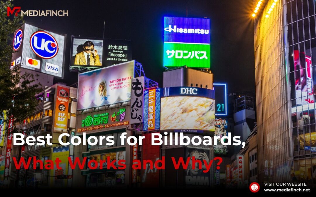
Choosing the right colors for billboard advertising is crucial as it not only grabs attention but also influences consumer behavior and brand perception. Colors serve as a silent yet powerful communicator, directly impacting how a message is received by the audience. In fact, research indicates that color can increase brand recognition by up to 80%, making it a key factor in advertising success. This blog explores the best colors for billboards, diving into color psychology in billboard advertising, and providing practical advice on selecting effective color combinations to make your campaign stand out.
Color Psychology in Advertising:
| Color Combination | Visual Effectiveness | Best Use Case |
| Black on Yellow | Very High | Ideal for warning signs, promotional offers, and key notices due to its striking visibility. |
| White on Blue | Very High | Great for corporate and trustworthy messages, commonly used by technology and health industries. |
| Red on White | High | Effective for sales and urgent announcements, as it captures attention quickly. |
| Yellow on Black | High | Excellent for detailed information that needs to stand out both day and night. |
| Blue on White | High | Perfect for calm, serene messaging and brands aiming to promote trust and reliability. |
| Green on White | Medium | Good for environmental and organic products, symbolizing freshness and vitality. |
The Most Effective Colors for Billboards:
When it comes to billboard advertising, vibrant and luminous colors tend to be the best colors for billboards because they are highly visible from a distance. Bright yellows, bold reds, and vivid oranges are among the most attention-grabbing hues, especially when placed against contrasting backgrounds. For example, a billboard using a fiery red text on a clean white background can achieve up to 42% more retention than non-contrasting color schemes.
Color Combinations That Stand Out:
Effective eye-catching color combinations involve colors that contrast well with each other, enhancing readability and viewer attraction. The classic black on yellow or white on blue can be seen from great distances and under various lighting conditions, making them excellent choices for billboard advertising. According to research, using high contrast color combinations can improve the visibility of your message by 40%.
Considerations for Different Environments:
The effectiveness of billboard colors can vary significantly depending on their environment. In urban settings with lots of competing stimuli, neon or bright colors like hot pink and electric blue can cut through the visual noise. Conversely, in natural or rural settings, earth tones such as greens and browns blend too closely with the environment, reducing visibility. Always consider the backdrop and lighting of the billboard’s location to maximize impact.
The Role of Branding in Color Choice:
Selecting the best campaign colors means aligning your billboard’s color scheme with your brand’s identity to ensure consistency across all marketing channels. This consistency helps in enhancing customer recall and reinforcing brand identity. For instance, Coca-Cola’s use of red not only draws attention but also maintains their brand’s iconic look across all advertising platforms.
Innovations in Billboard Colors and Materials:
Advancements in materials and digital technologies have expanded the possibilities for using different colors and effects in billboard advertising. Reflective and illuminated billboards can make colors pop during different times of the day, expanding the ad’s effectiveness to nighttime hours. The use of LED screens has also allowed advertisers to employ dynamic billboard color & contrast changes, which can attract more viewers and keep the content fresh.
Conclusion:
The best colors for billboards is crucial for the success of any outdoor advertising campaign. By leveraging color psychology in billboard advertising and innovative billboard color & contrast techniques, marketers can create compelling and memorable advertisements. Remember, the ultimate goal is to make a lasting impression that not only captures attention but also promotes meaningful engagement with the brand.
FAQs
What color attracts the human eye most on billboards?
Bright colors like red and yellow are the most visually appealing and attention-grabbing. These colors are quick to spot and easy to remember, making them top choices for effective billboard advertising.
How do I choose the right color for my billboard ad?
Consider your brand colors, the message of the ad, and the environment where the billboard will be placed. Use high contrast and eye-catching color combinations to ensure visibility and impact.
Can the color of a billboard affect the readability of the text?
Absolutely. Billboard color & contrast are critical in ensuring that the text on a billboard is readable from a distance. Poor color choices can lead to a lack of visibility and diminished ad effectiveness.
Are there any colors that should be avoided in billboard advertising?
Subdued or earthy tones such as browns and greens should generally be avoided unless they are used strategically with high contrast elements, as they tend to blend into outdoor environments and reduce ad visibility.